Web Design
Evan Mcallister
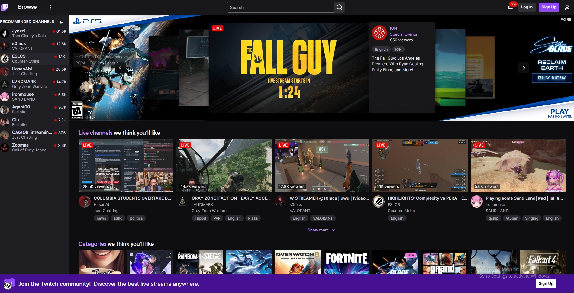
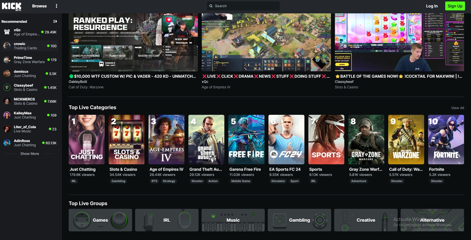
These two images of Twitch (left image) and Kick (right image) are the home pages of two video streaming websites. Overall, the sites use a very similar layout and navigation style.
Design Practices
- The major parts are accessible from the home page
- This is particularly important for sites like these where easy access to the desired content is important. The search function and category pages for content are likely the most used parts of the sites. Both sites have these easily identifiable from the home page.
- Users can easily return to the home page
- On both of the sites, the logo is used as the home button to return to the main page from other pages. This is a feature for many websites so it is intuitive.
- Contrast
- Color contrast is important for readability on all websites. These two sites both have good contrast. They use their dark theme with white or light grey text to provide contrast. They also use green or purple to highlight or identify the most important text/buttons.
- Scannability
- Scannability is important for identifying the major sections of pages. The sites shown above have few words and distinct content with thumbnails. Both of these make the sites more scannable, especially when the focus is on distributing video content.
- Search Engine Optimization (SEO)
- SEO helps serach engines like Google list websites relevant to search terms. These sites were on the first page of results for "livestream site" using Google, which is what they are described like.
- Predictable links and buttons
- It is always good for these to be predictable. Boths of the sites use simple and clear phrasing for links and buttons.
Recommendations For Improvement
- Hover over a stream thumbnail to see a preview of the stream.
This would be a cool feature for browsing the content. - Remove ads from the stream when for first viewing.
When I clicked on a stream to see what it was, Twitch has an ad that plays before being able to see it.
This decreases engagement with the content. - Combine the content categories.
Kick has categories and category groups shown seperately.
It may be a good idea to combine these to make the page more concise.
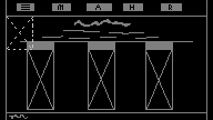
Wireframe Design